Black is black! Isn’t it?
It may surprise you to learn that there’s more to black than meets the eye...
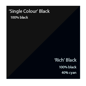
To get the best from our process, black can be produced in two ways.
The first method is single colour black, made from 100% black ink. This is ideal for small areas less than 2cm square such as text or logos.
On areas of over 2 cm squared in size, single colour black can appear washed out and uneven. This is because the rollers on printing presses roll the ink off over a large area.
The alternative is rich black, which consists of 100% black and 40% cyan. A rich black should be used on larger areas to ensure an even, dark coverage, as the second ink colour disguises any inconsistencies. However, rich black should never be used on small text as any tiny deviance in registration will lead to a blurred effect.
Be aware that the higher the percentage ink coverage, the longer the drying time required. This is particularly true of uncoated stocks such as letterheads.
Black will inevitably appear duller on uncoated stock because of the
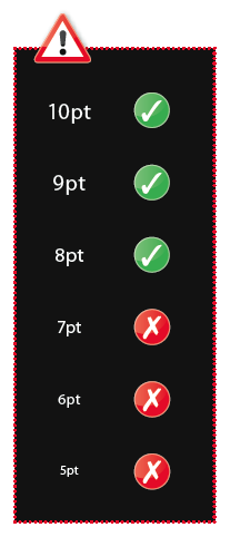
absorbency of the paper. This absorbency also means that any fine detail reversed out of black may disappear. We do not recommend less than 6pt text, for example, on uncoated stock.
You may think that it would be okay to have ‘three or four colour’black text as long as the total ink coverage is less than 300%. You’d be wrong! Black text should never have more than 140% ink coverage. “Four colour black” text is virtually impossible to print, will look blurred and may cause sheets to stick together.
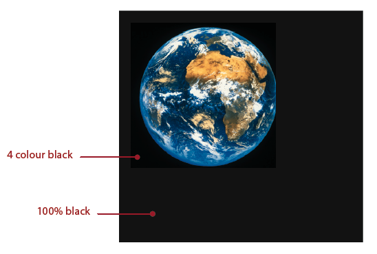 Also be aware that black within a photograph as a background may have a different CMYK make-up to other parts of your design. This will be noticeable when printed, even if not on screen. Placing a photograph with a black background over a black area in InDesign®, for example, may reveal a difference between the two shades of black when printed.
To overcome this, take a sample of the black that the background is required to match in an application such as Photoshop (use the colour picker tool). Then simply mix the matched colour in, say, InDesign® – paying careful attention to the overall ink coverage.


 Print this page